The Architectural Psychology of Two-Tone Cabinets
The two-tone kitchen cabinet trend is far more than a fleeting aesthetic choice; it is deeply rooted in architectural psychology and spatial design principles. By employing different colors for upper and lower cabinets, designers can strategically manipulate the perceived dimensions of a room. At ai-architectures.com, our AI models are trained on these exact spatial dynamics to generate hyper-realistic, structurally accurate renderings.
Darker colors carry visual "weight." When applied to lower cabinets—often referred to as base cabinets—hues like deep navy, forest green, charcoal, or even natural walnut serve to anchor the room. This grounds the eye and creates a sturdy, foundational feel. Conversely, matching upper cabinets in the same dark shade can often make a kitchen feel top-heavy, enclosed, or cavernous.
Lifting the Ceiling: The Role of Upper Cabinets
The secret to an expansive, airy kitchen lies in the upper visual hemisphere. By transitioning to a lighter color—such as warm white, soft cream, or pale greige—for the upper cabinets, you effectively blur the line between the cabinetry and the ceiling. This optical illusion draws the eye upward, making standard 8-foot ceilings feel significantly taller.
Light Reflectance Value (LRV)
Lighter uppers maximize natural light from windows, bouncing it back into the room and reducing the need for heavy artificial lighting.
Focal Point Management
A muted upper allows statement backsplashes or high-end range hoods to command attention without overwhelming the space.
Appliance Integration
Two-tone designs offer greater flexibility when matching stainless steel, black, or custom panel-ready appliances.
Transitional Harmony
Perfect for open-concept homes where the kitchen must seamlessly blend into adjacent living and dining areas.
Zero Risk, Infinite Creativity with ai-architectures.com
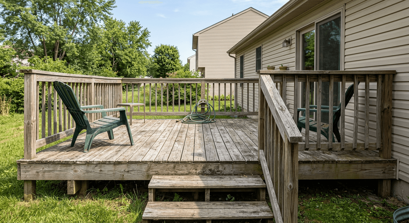
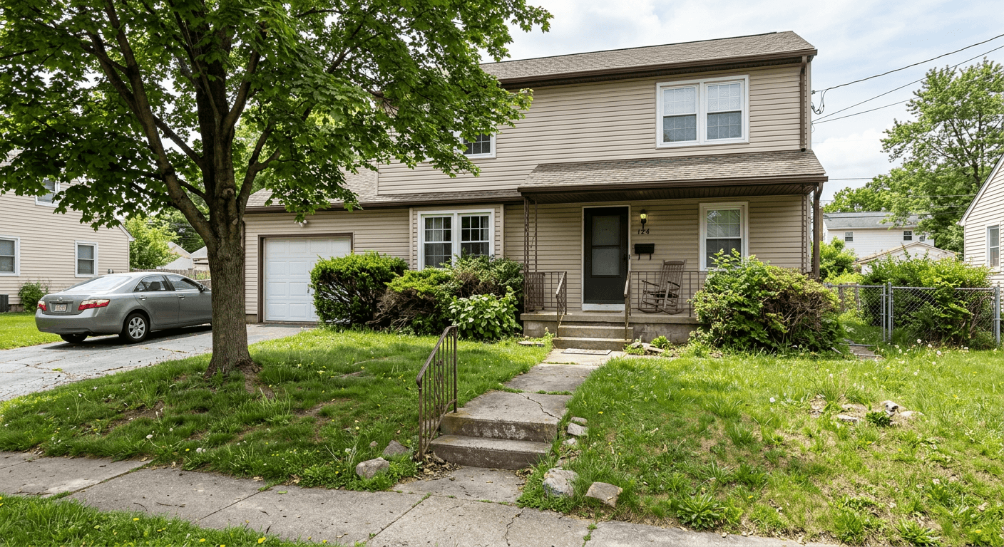
Committing to a two-tone cabinet remodel in real life involves significant financial outlay, extended labor timelines, and the terrifying "what if" moment when the paint dries. What if the undertones clash? What if the lighting makes the navy look black? What if the contrast is too harsh?
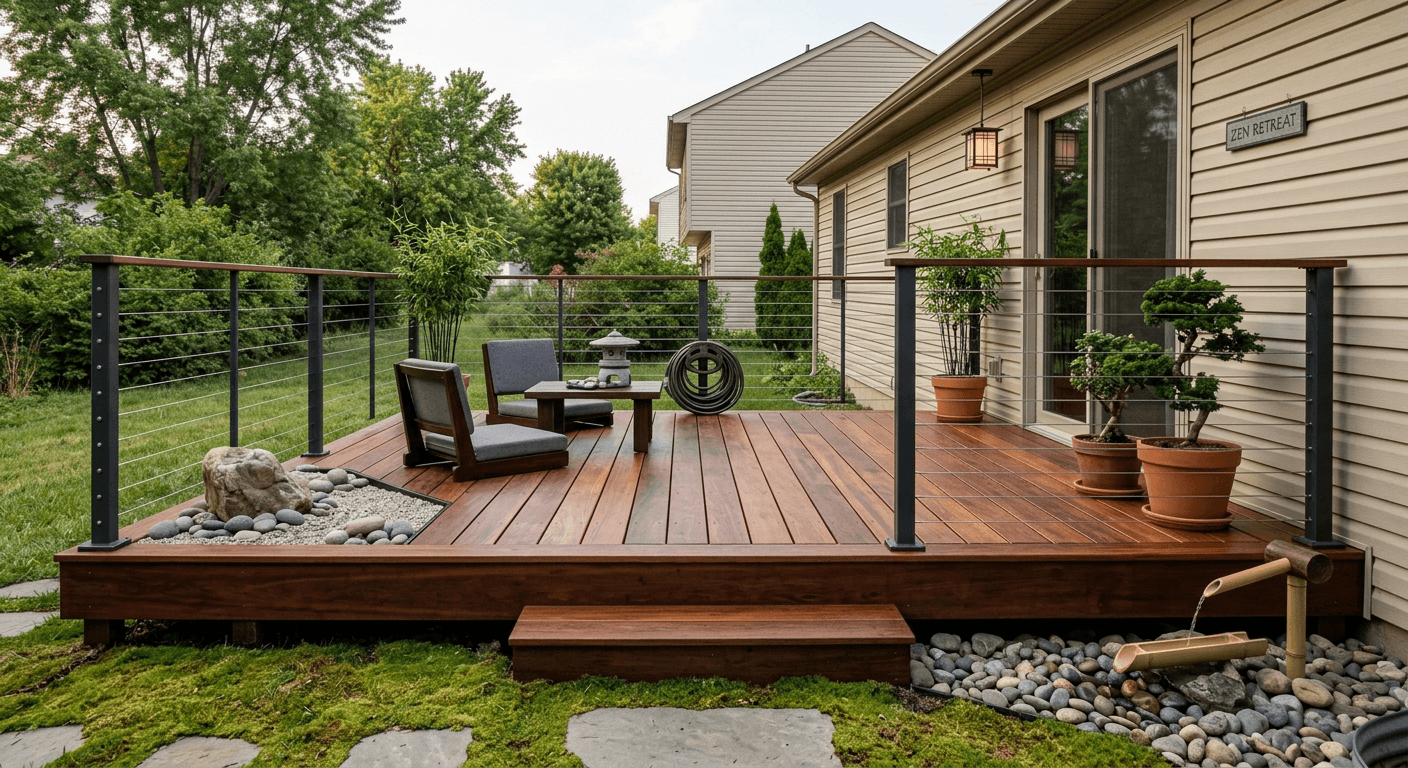
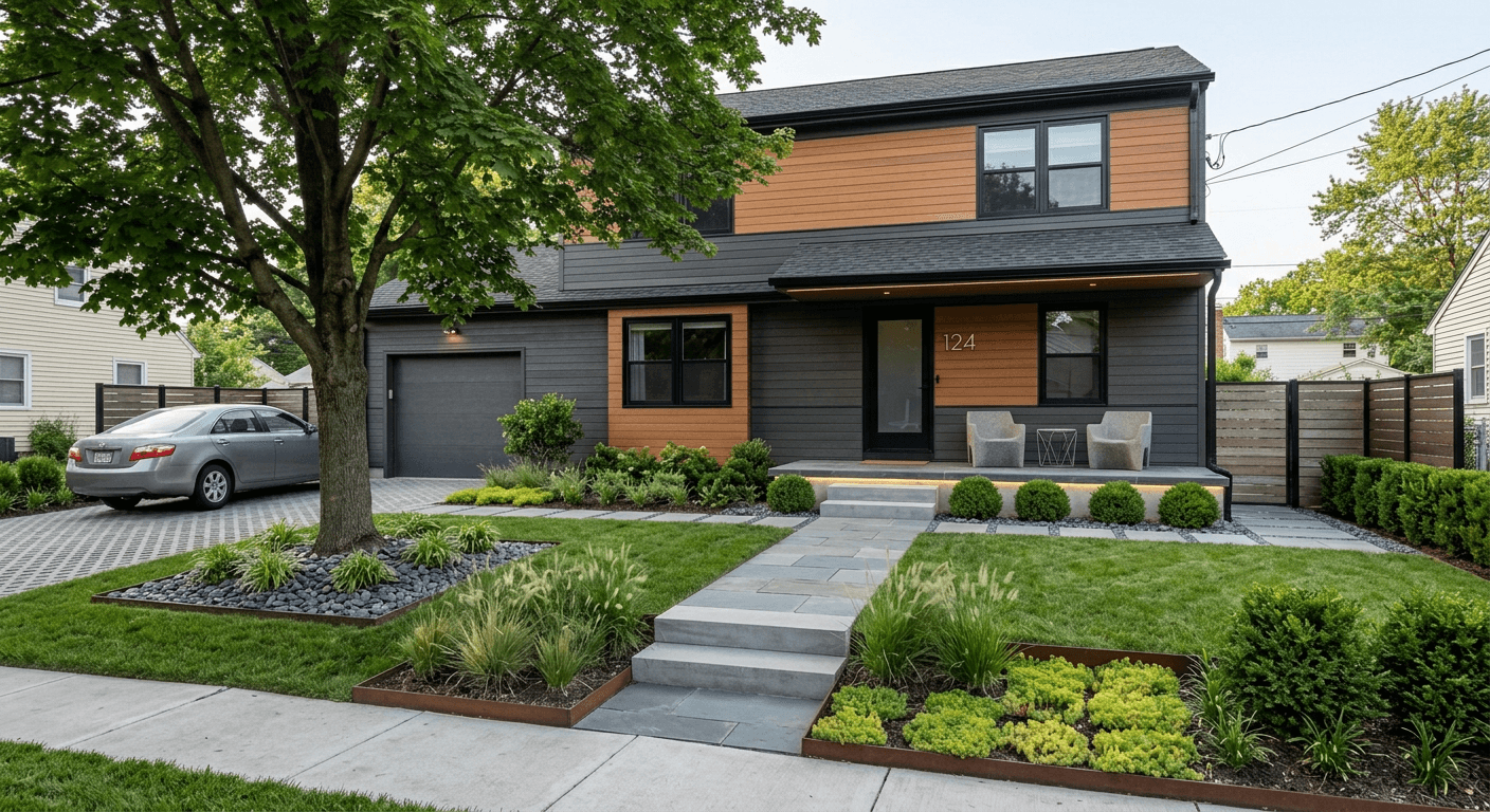
This is where ai-architectures.com revolutionizes the interior design workflow. Our advanced neural networks allow you to eliminate risk entirely. By uploading a photo of your current kitchen, you can generate pixel-perfect previews of endless two-tone combinations.
On-Trend Combinations to Try in Our Visualizer:
How to Achieve the Perfect Two-Tone Balance
When utilizing our visualizer to preview your next remodel, keep these architectural best practices in mind to ensure a cohesive look:
- Respect the Horizon Line: The transition between upper and lower colors should make logical sense. Usually, the countertop serves as the perfect equator. Avoid randomly mixing colors on the same vertical plane unless creating an intentional focal point like a kitchen island.
- Unify with Hardware: Different colored cabinets can feel disjointed if not tied together. Using consistent hardware—such as knurled brass pulls on both the dark lowers and light uppers—creates a visual bridge that harmonizes the space.
- Consider Wood Tones: Two-tone doesn't just mean two paint colors. Pairing flat-panel painted uppers with rich, natural wood-grain lowers (like rift-sawn oak) is an incredibly luxurious, on-trend approach in organic modern architecture.
- Lighting is Everything: Paint colors shift dramatically depending on the color temperature (Kelvins) of your lighting. Utilize the ai-architectures.com prompt to specify the time of day, ensuring your two-tone design looks stunning whether bathed in morning sunlight or illuminated by evening pendents.
Stop Guessing. Start Visualizing.
The era of taping tiny paint swatches to your cabinets is over. Leverage the power of AI to confidently step into the two-tone trend. Scroll up to our interactive widget and type your vision—your dream kitchen is just a prompt away.